New Analytics Features Available in CarmenCanvas

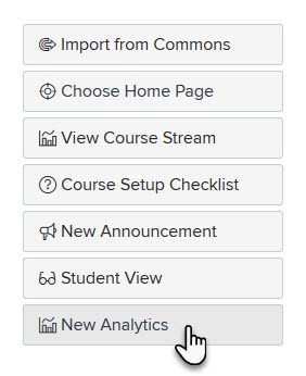
Have you checked out the New Analytics feature in your CarmenCanvas courses? You will notice a new look and feel as well as additional metrics!
Previously, views of student activity were limited. Now in New Analytics, you will see weekly activity aggregated. You can also sort that activity by resource, which means you don’t have to comb through individual student data records to find out what items are getting the most attention from students. You can now view data by each page, file, assignment or other resource in your course.
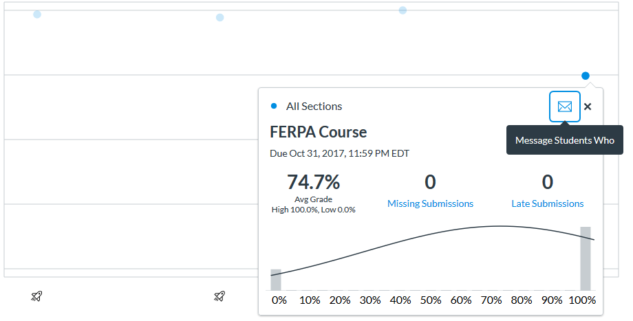
You may notice some new features around grades as well. Easy-to-use score distribution charts in New Analytics show you the class average and a bell curve. You can also easily message students who are missing assignments from within the analytics tool; you can also directly message students who scored between a particular range on an assignment. This way, you can quickly reach students who may be struggling and offer them additional study sessions or materials. (You can also congratulate the highest scorers for a particular assignment or assessment!)
 This latest update to the analytics features in Canvas is also a huge win for accessibility. All of the charts are ADA compliant and can be read and interpreted with assistive technology, such as a screen reader.
As you explore the new analytics page for your courses, it is important to keep in mind that the data is on a 24-hour refresh cycle. Any updates you make to grades today won’t be reflected until tomorrow. Larger courses with a vast amount of assignments will have trouble loading the analytics graphs. This is something that Instructure is aware of as a known issue.
